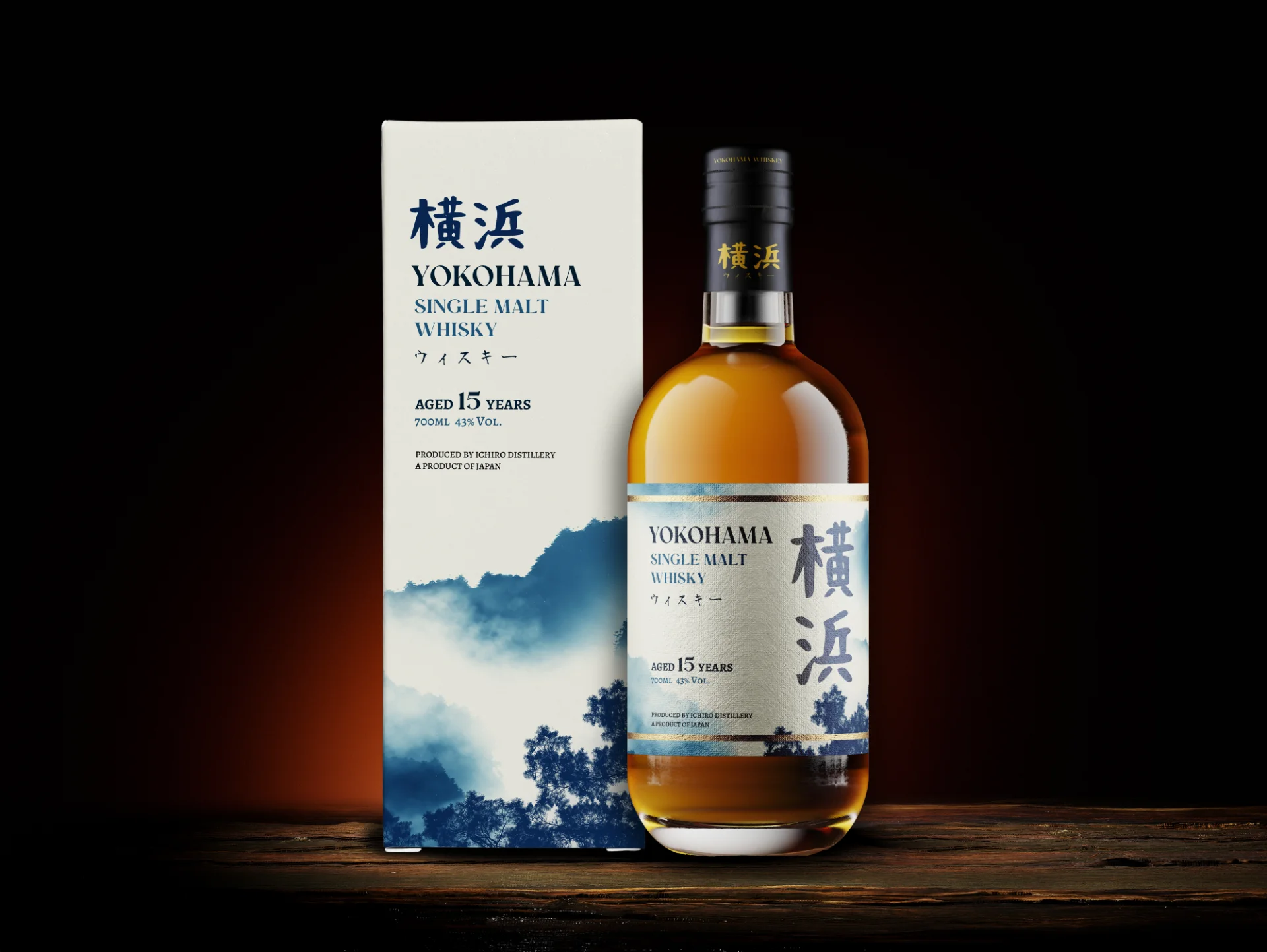
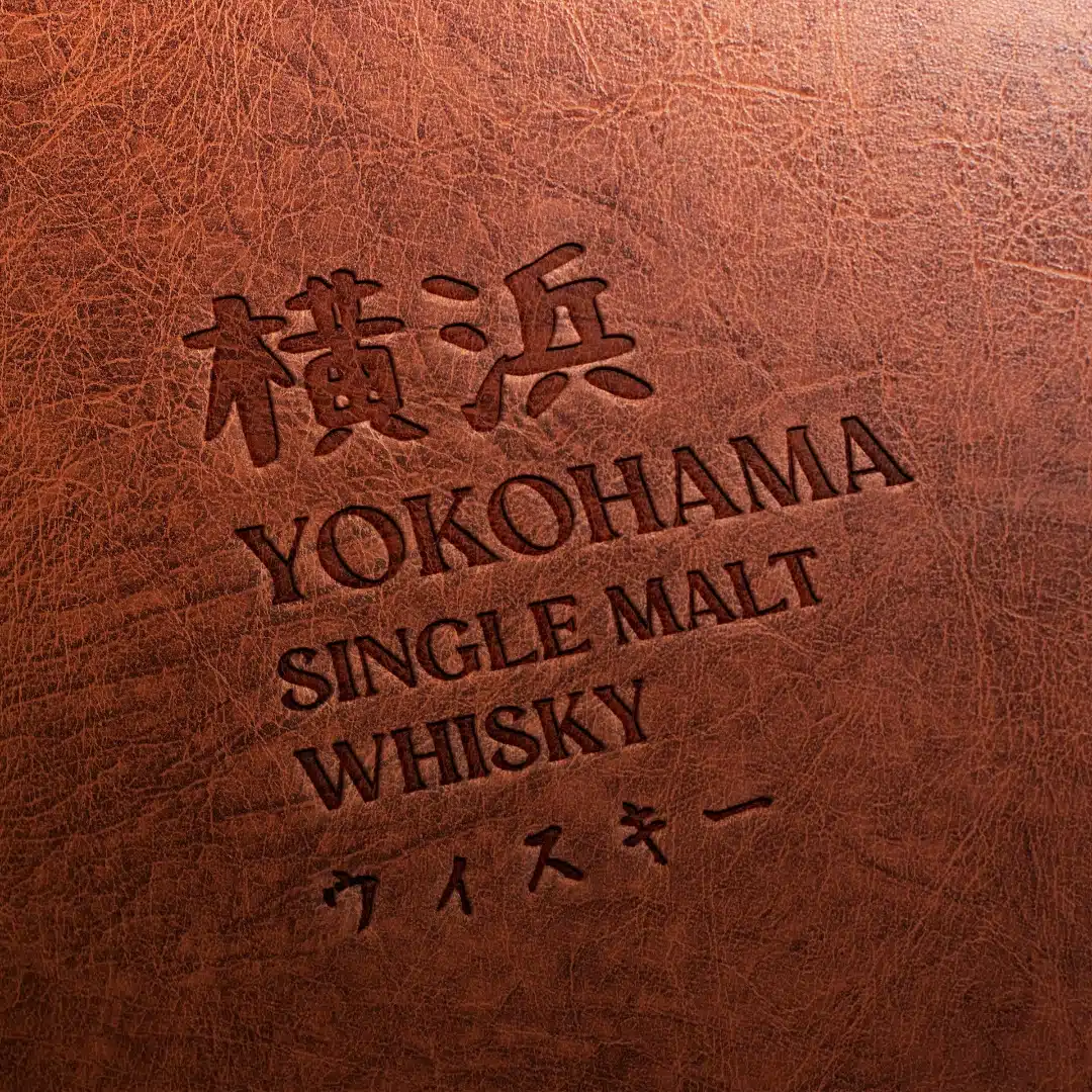
Yokohama Single Malt Whisky is a premium spirit that pays tribute to the beautiful city of Yokohama, Japan, and the art of whisky-making. This exceptional whisky captures the soul of Japanese craftsmanship and elegance, offering a unique experience for connoisseurs.
Client
Ichiro Distillery
Industries
Food & Beverage
Services
Branding, Packaging Design
[ Challenge ]
The challenge was to design packaging that not only reflects the rich heritage and artistry behind the whisky but also highlights its luxurious nature. The packaging had to evoke a sense of exclusivity and craftsmanship while staying true to the cultural essence of Yokohama.
[ Approach ]
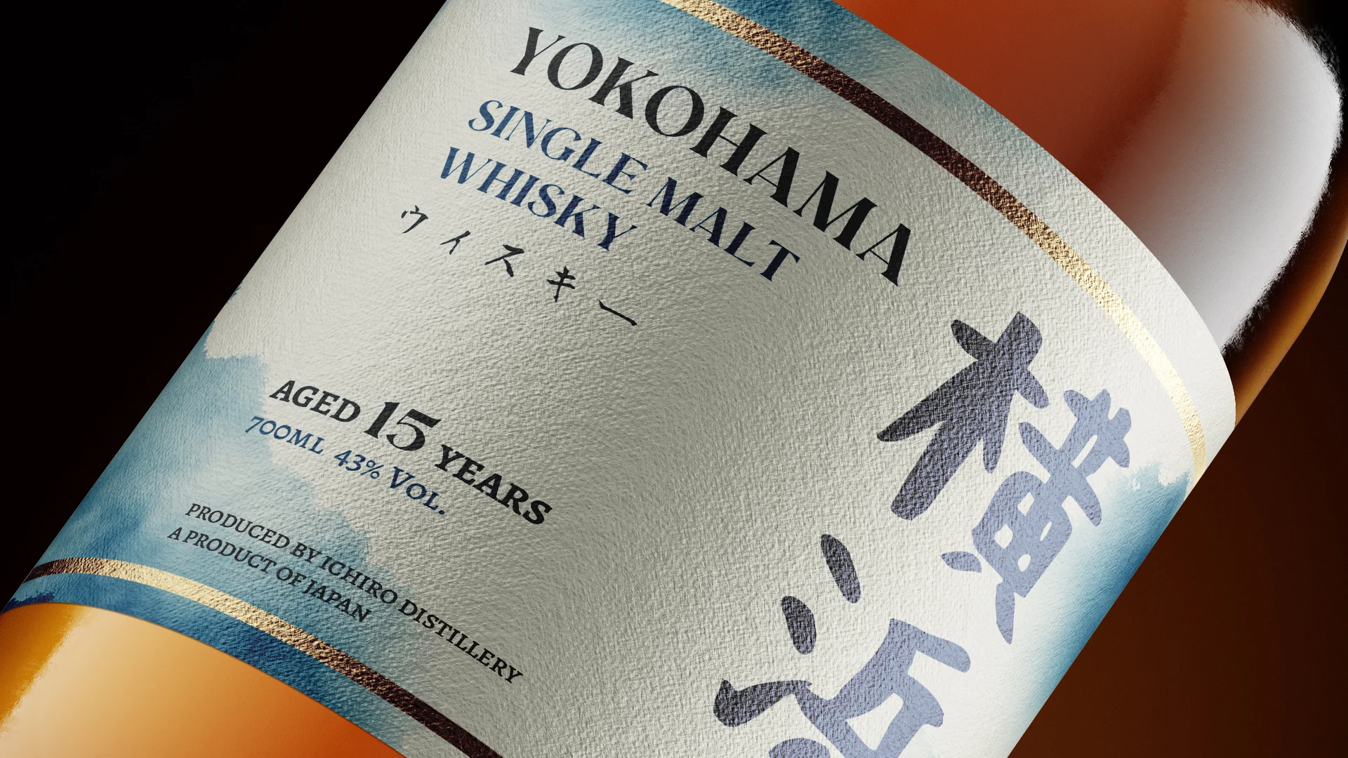
The design embraces minimalism, a hallmark of Japanese aesthetics. A delicate Japanese painting was chosen to represent the brand’s cultural roots, printed on premium handmade paper for a truly tactile and visual experience. This choice reflects both the serene beauty of Yokohama and the intricate craft of whisky-making.
Subtle gold accents were incorporated into the design, enhancing its luxurious appeal without overpowering the simplicity of the overall aesthetic. The result is a sophisticated yet understated packaging that elevates the drinking experience.